
Available Charts and Graphs
Charts appear in the report canvas under the report tab you choose. The default is a horizontal bar chart for most choice questions: answer labels sit over full-width 100% tracks, making long labels easy to scan.
Open an item’s menu to choose a chart type. Recommended types are marked in the menu. Each item has one menu for its chart, data-table, rename, print, hide, and delete settings. Show data table is a toggle and its setting persists.
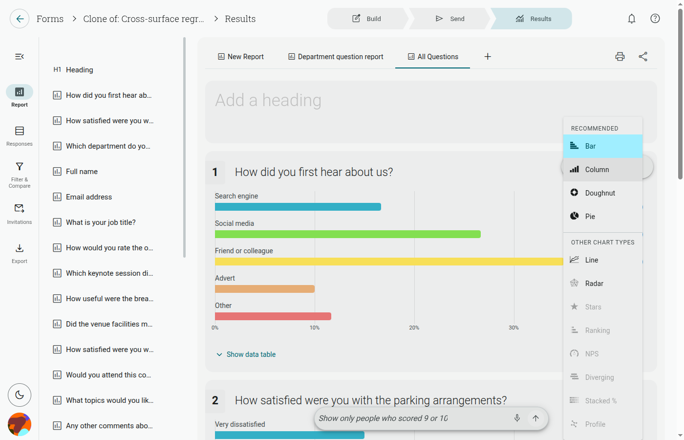
Chart types
Section titled “Chart types”- Horizontal bar: the general default for choice questions.
- Diverging stacked bar: recommended for scale batteries, matrix, opinion-slider, and Likert questions. It names both poles and can use a 100% stacked mode.
- Profile (snake): recommended for semantic differentials. It plots the profile with ±1 SD whiskers.
- Radar: available where it suits the question; the redesigned scale makes it easier to read.
- Stars, ranking, and NPS: available for their matching question types.
- Other supported types: the type menu shows the options available for the selected question.
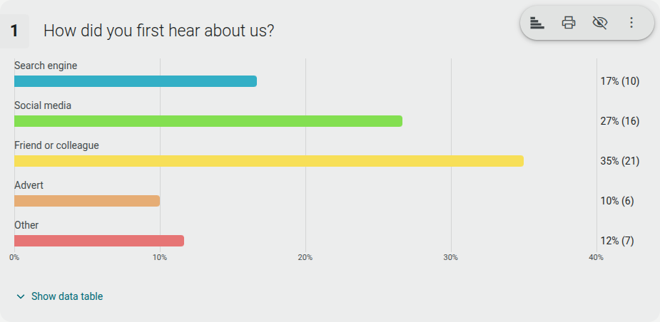
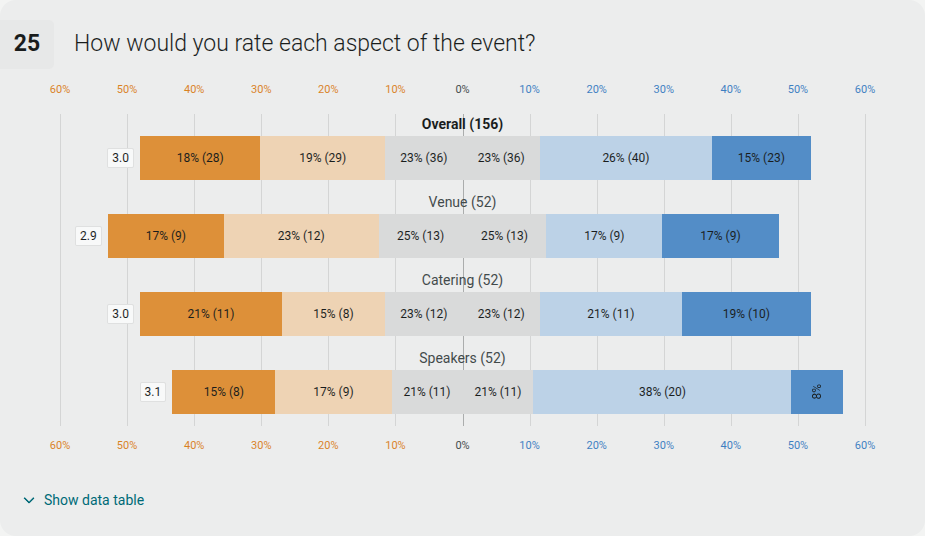
Shout uses one consistent type scale and a lighter data grid across charts. The report’s chart menu is the source of truth because available types depend on the question type.
Change a chart
Section titled “Change a chart”- Select a report tab.
- Open the menu on the question item.
- Choose the chart type. Select 100% stacked when you want proportions rather than counts.
- Use Show data table if you need the supporting values.
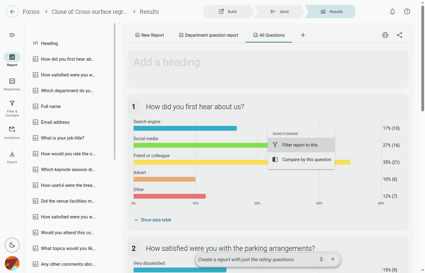
Clicking a bar, segment, or point also opens quick actions: Filter report to this or Remove this filter, and Compare by this question or Stop comparing by this question. Use Filter & Compare for advanced rules.